Hulu
Enhancing and streamlining content discovery for Hulu subscribers
Role
Sole UX Designer
Duration
Jan. 2025 - March 2025
Tools
Figma, Figjam
As part of my Prototyping class at MICA, I had the opportunity to dive into a two-month academic project to improve and expand the content discovery experience within the Hulu app. My goal was to make browsing and finding content easier, rethink how viewers interact with shows and movies, and build stronger connections between Hulu and its subscribers.
The Problem
Hulu subscribers struggle to explore content and experience stream fatigue
Finding new shows or movies to watch can be challenging. While my peers and I enjoy Hulu's content library as avid streamers, we often find it hard to discover shows and movies that match our interests without having a specific title in mind. Moreover, the vast array of content available on streaming platforms can feel overwhelming. This decision fatigue makes the selection process daunting and time-consuming.
Having experienced this firsthand, I set a goal to address the issue: How might we help Hulu subscribers discover content and make confident viewing decisions?
The Solution
Research
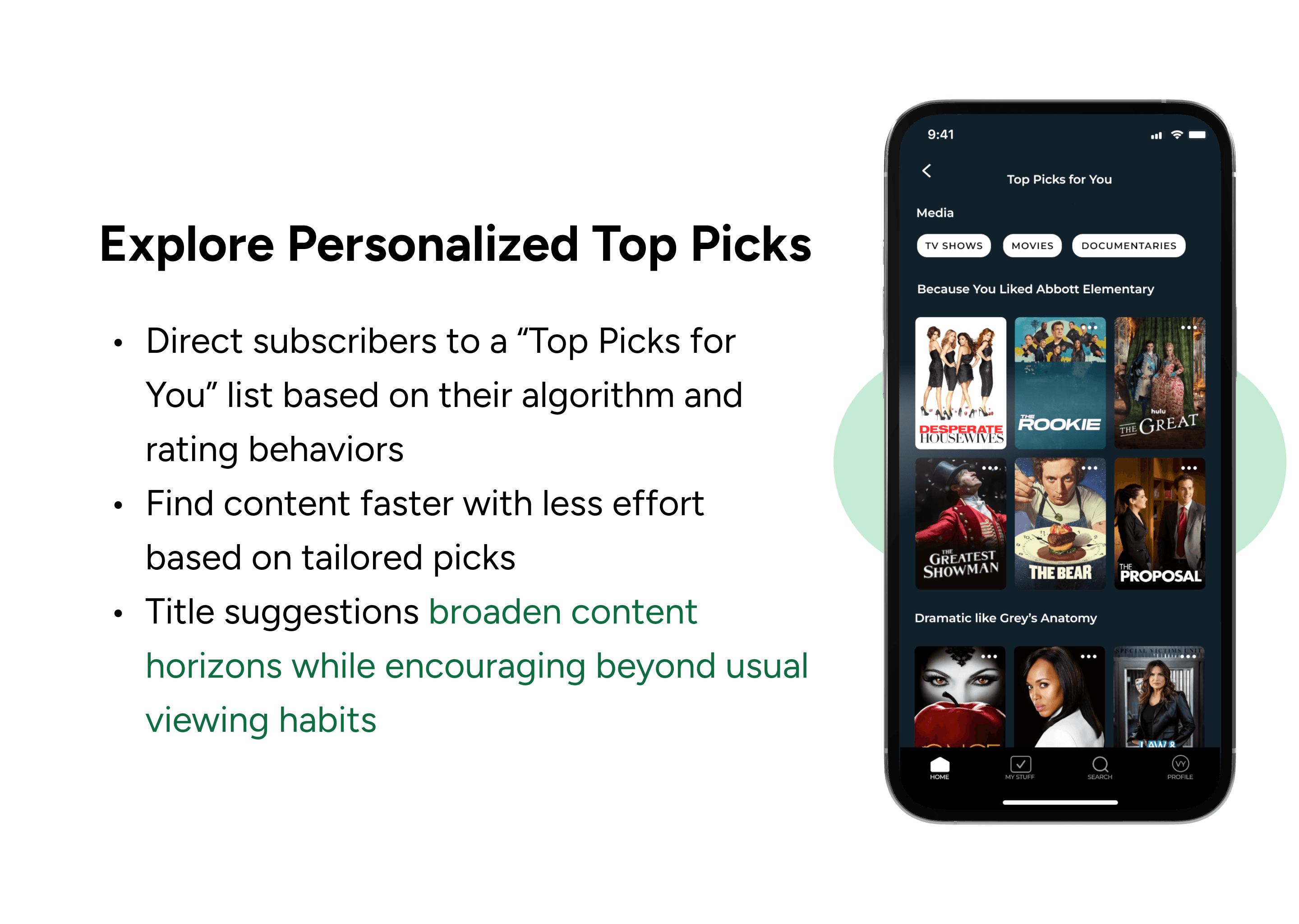
As the number of library titles increases, subscribers' selection ability decreases
Beginning with white paper research, I researched articles on content discoverability, stream fatigue, and streaming viewing habits. Upon my research, I found striking statistics from a study released by Comcast Advertising:
I framed the core challenges into a clear problem statement to clarify subscriber needs and their underlying impact.
Understanding the Subscriber
After identifying the core challenges and formulating the problem statement, I gained a better understanding of the issues that subscribers encounter when trying to discover content and choosing something to watch. Based on my analysis, I created three user stories to ensure their efforts are aligned with the goals and provide valuable perspectives.
Design
Sketching ways to increase engagement and exploration of content
Keeping my research and user stories in mind, I created low-fidelity and high-fidelity wireframes that focused on my user stories and reimagined the current experience. These included the home page, a personalized recommendations section, a title selection page, a search page, a genre selection, and a view more page.

As part of my Prototyping class at MICA, I had the opportunity to dive into a two-month academic project to improve and expand the content discovery experience within the Hulu app. My goal was to make browsing and finding content easier, rethink how viewers interact with shows and movies, and build stronger connections between Hulu and its subscribers.
The Problem
Hulu subscribers struggle to explore content and experience stream fatigue
Finding new shows or movies to watch can be challenging. While my peers and I enjoy Hulu's content library as avid streamers, we often find it hard to discover shows and movies that match our interests without having a specific title in mind. Moreover, the vast array of content available on streaming platforms can feel overwhelming. This decision fatigue makes the selection process daunting and time-consuming.
Having experienced this firsthand, I set a goal to address the issue: How might we help Hulu subscribers discover content and make confident viewing decisions?
The Solution
Research
As the number of library titles increases, subscribers' selection ability decreases
Beginning with white paper research, I researched articles on content discoverability, stream fatigue, and streaming viewing habits. Upon my research, I found striking statistics from a study released by Comcast Advertising:
I framed the core challenges into a clear problem statement to clarify subscriber needs and their underlying impact.
Understanding the Subscriber
After identifying the core challenges and formulating the problem statement, I gained a better understanding of the issues that subscribers encounter when trying to discover content and choosing something to watch. Based on my analysis, I created three user stories to ensure their efforts are aligned with the goals and provide valuable perspectives.
Design
Sketching ways to increase engagement and exploration of content
Keeping my research and user stories in mind, I created low-fidelity and high-fidelity wireframes that focused on my user stories and reimagined the current experience. These included the home page, a personalized recommendations section, a title selection page, a search page, a genre selection, and a view more page.
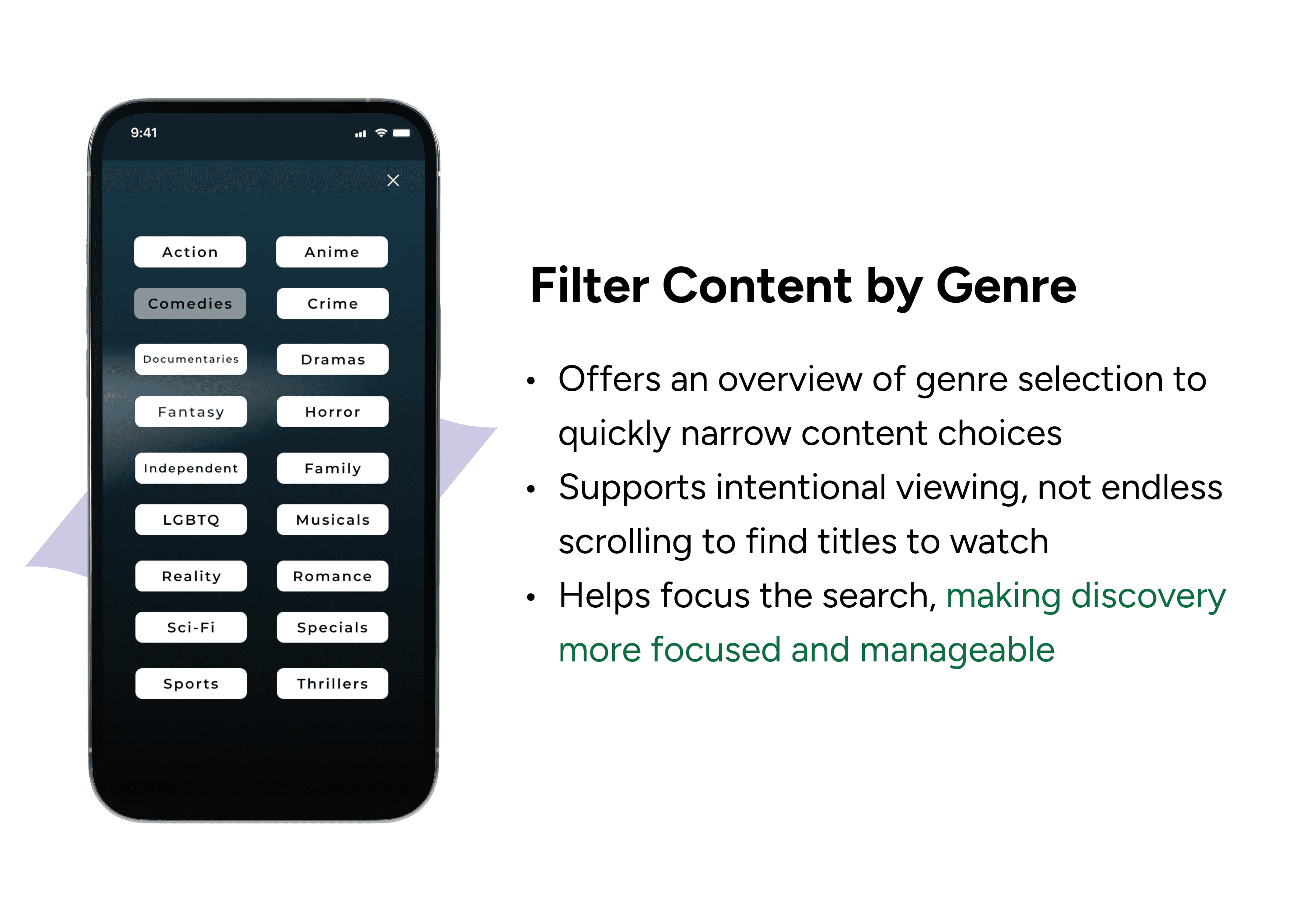
Genre Filter Iterations
Initially, I designed a genre content page for subscribers after selecting a specific genre. However, this approach did not facilitate content exploration when users clicked on the genre. For two weeks, I explored and iterated on various potential features, like a generated genre and mood-based mix of content tailored to viewing habits and rating behavior. Through iteration, I was able to expand the breadth and depth of the experience.
Prototyping
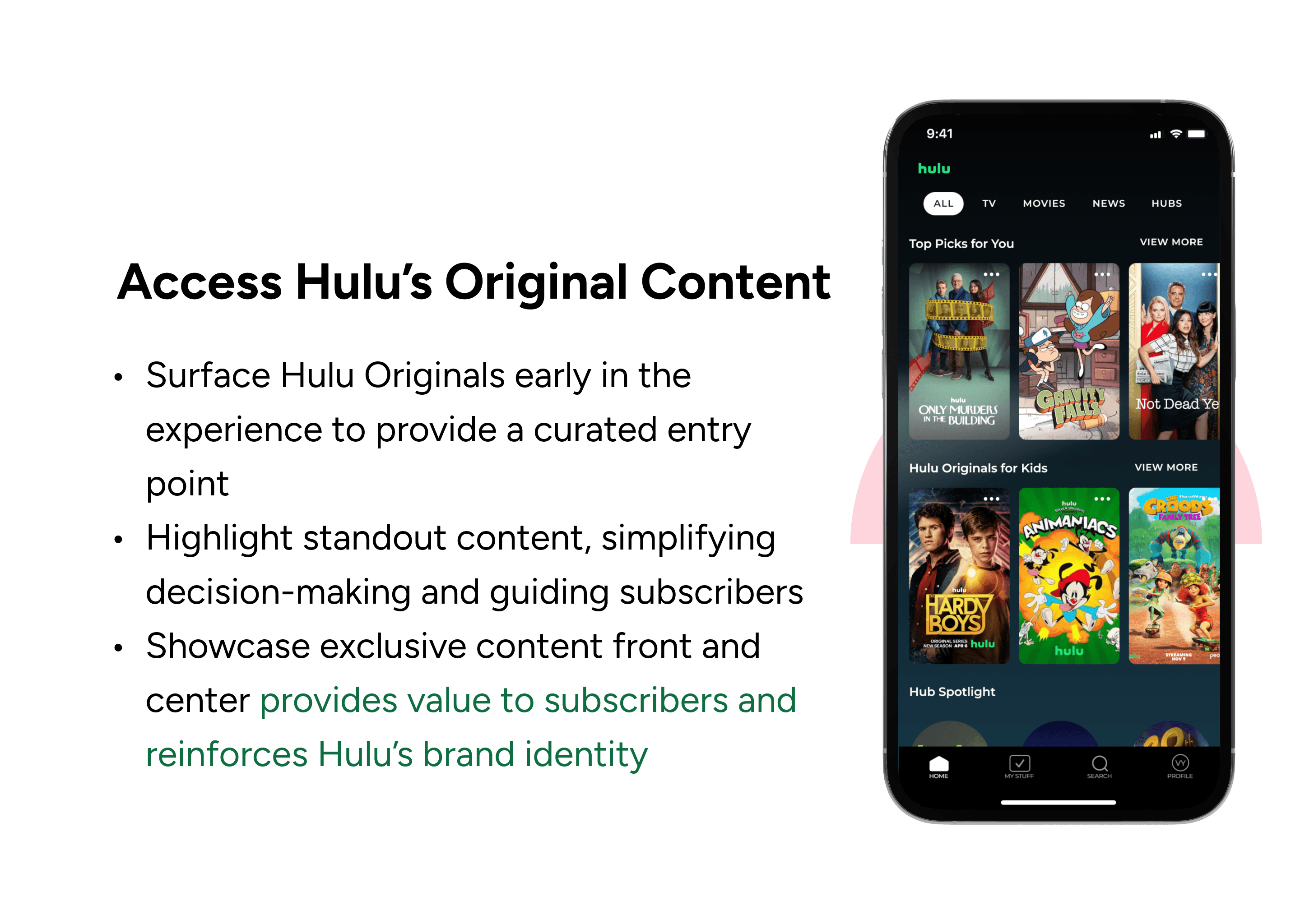
With all the iterations in place, I began translating my wireframes into high-fidelity prototypes. I prioritized working functionality for all the “core areas” that were expected/to be critical for usability testing. This included the home page, search page, genre filter, title selection, and Hulu’s Hub sections. Later on, I added some fun animations to make the experience dynamic and bring delight when exploring content!
Prototyping
With all the iterations in place, I began translating my wireframes into high-fidelity prototypes. I prioritized working functionality for all the “core areas” that were expected/to be critical for usability testing. This included the home page, search page, genre filter, title selection, and Hulu’s Hub sections. Later on, I added some fun animations to make the experience dynamic and bring delight when exploring content!
Test
The proof is in the pudding
I tested my prototypes with three users who have used Hulu or other streaming platforms to validate their effectiveness. After conducting three usability tests, I discovered that users responded positively to the "Top Picks" section and appreciated the app's content suggestions. However, they expressed a desire for more control within this section, specifically the ability to filter content by category (such as Movies, Shows, etc.).
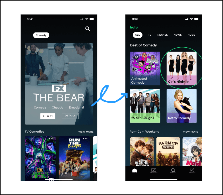
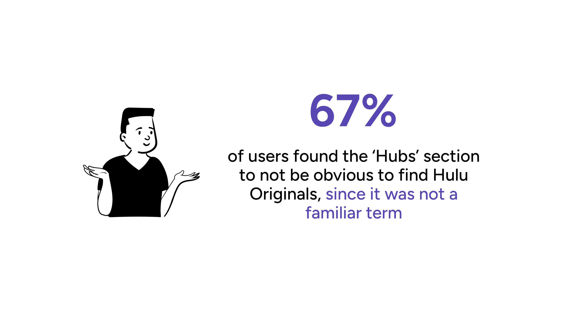
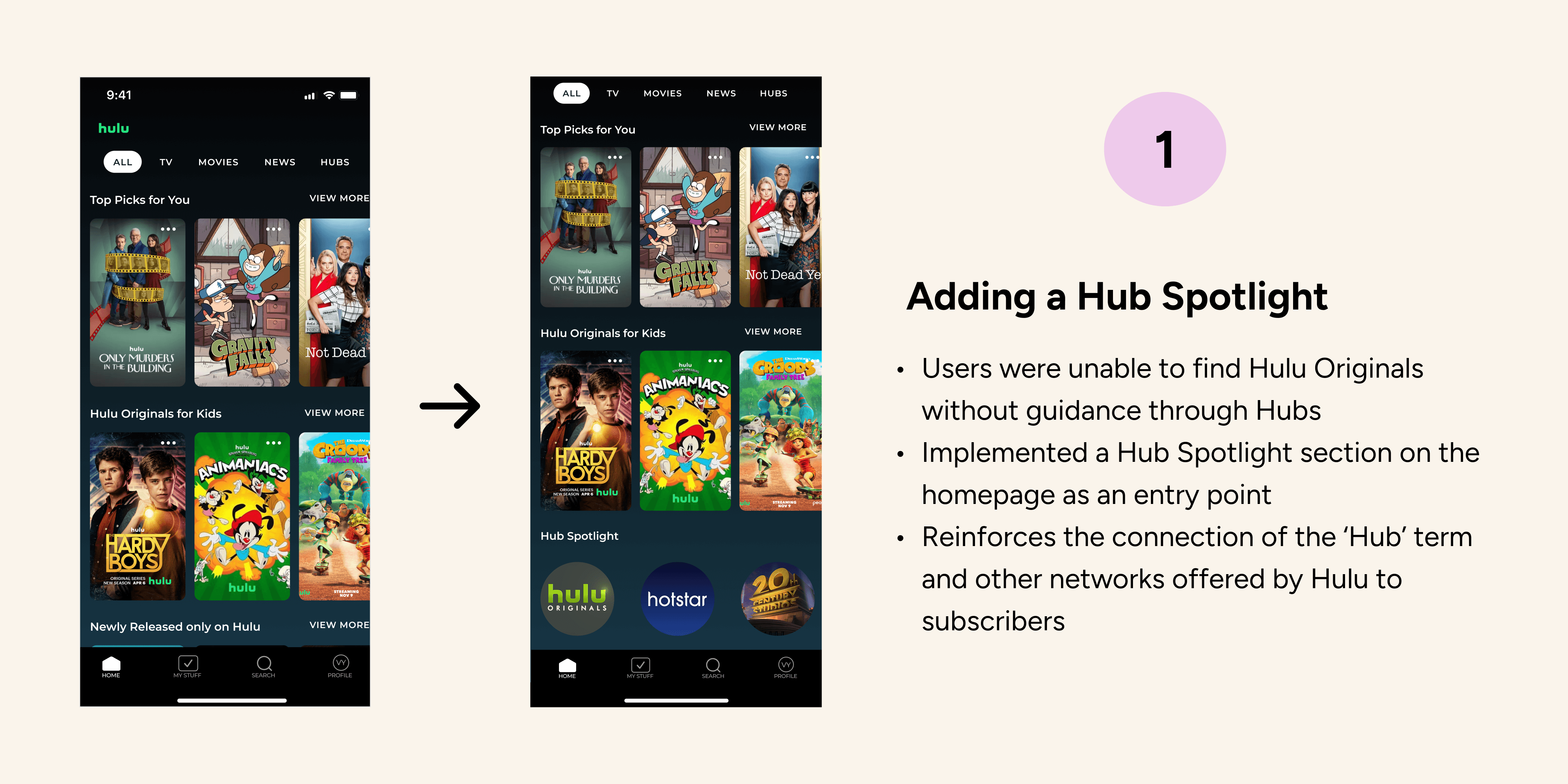
I also found that there was still room for improvement for other features. This included unfamiliar language for onboarding subscribers who may not understand what exactly ‘Hubs’ is.
Some users were confused by the genre filtering feature. When they clicked, instead of a dropdown list with a downward-facing arrow appearing, a bottom sheet was displayed. Based on valuable insights from usability testing + instructor feedback, I addressed these issues by clarifying the content and refining the design over the following three weeks, implementing two key improvements.
Test
The proof is in the pudding
I tested my prototypes with three users who have used Hulu or other streaming platforms to validate their effectiveness. After conducting three usability tests, I discovered that users responded positively to the "Top Picks" section and appreciated the app's content suggestions. However, they expressed a desire for more control within this section, specifically the ability to filter content by category (such as Movies, Shows, etc.).
I also found that there was still room for improvement for other features. This included unfamiliar language for onboarding subscribers who may not understand what exactly ‘Hubs’ is.
Some users were confused by the genre filtering feature. When they clicked, instead of a dropdown list with a downward-facing arrow appearing, a bottom sheet was displayed. Based on valuable insights from usability testing + instructor feedback, I addressed these issues by clarifying the content and refining the design over the following three weeks, implementing two key improvements.

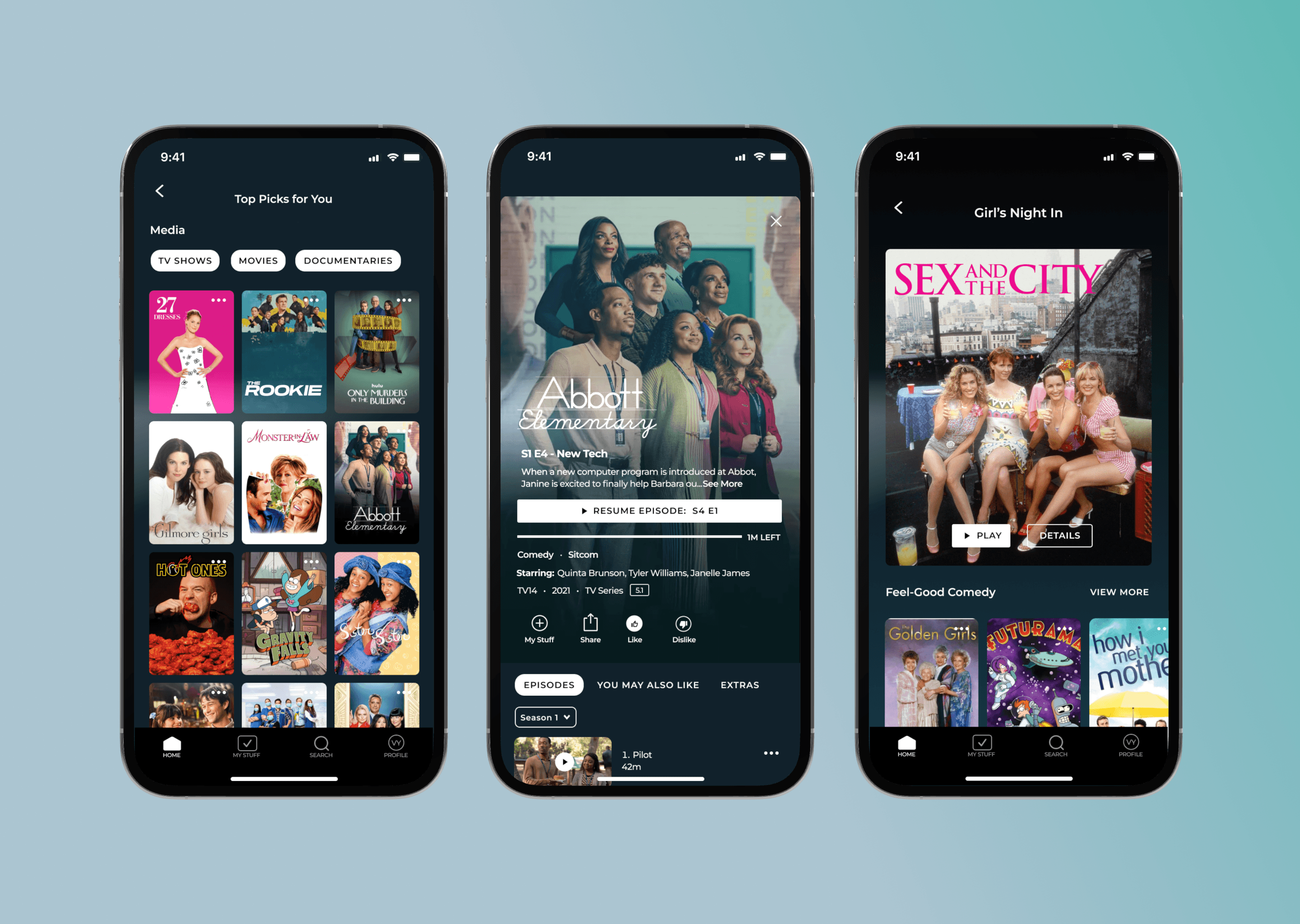
The Main Screens
The final product
The Main Screens
The final product

Reflection
Next Steps + What I’ve Learned
This project presented numerous challenges that helped enhance my skills as a designer 🥹. It was my first experience creating a design system, and it was incredibly helpful, despite the initial learning curve. The consistent feedback I received from my instructor and users helped ensure that the final solution was both practical and user-centered.
Moving forward, here’s what I would have done differently and what I learned:
If I had more time. If time permits, I would have liked to interview Hulu users to gain insights and understand their pain points. It would also be interesting to run A/B testing to evaluate feature performance and compare the results with metrics.
The design process was anything but linear, but I gained a lot of valuable knowledge. Within two months, I had redesigned and reimagined the current experience. It was no easy feat, but the process and result made it rewarding. I have come to realize the power of Figma, from its auto-layout features to its prototyping capabilities. Designing for an entertainment app that people use daily was exciting.
✮ ⋆ ˚。𖦹 ⋆。°✩
✮ ⋆ ˚。𖦹 ⋆。°✩
✮ ⋆ ˚。𖦹 ⋆。°✩